Friday, November 12, 2010

Cork-board Calendar


This was another project from last year presented to me by Harvest Baptist. The theme the church was having for the year was 'First Things First'. The pastor wanted it to contain a list of priorities that he wanted to put before the church, plus it needed to have all the events of the church listed for each month. So I went with the idea of making it look like a real cork-board. The end result had the feel I was going after and portrayed the message well I thought.

No Vacancy


This was a project from last Christmas. I was asked by Harvest Baptist Church to design the cover for their Christmas Program. I knew I wanted an old sign look. So I found a picture of an old sign online (shown above) and went to work in Photoshop. I was fairly please with the end result considering I had to get this completed in one afternoon.

Monday, November 03, 2008

How to Fold an Airplane


Everyone knows how to fold an airplane, right? Well, it's one thing to know and another to draw out a diagram in order to show others how to do it. This was for my Sister-in-Law who had an assignment for a job promotion. She had three choices, demonstrate how to wash a car, brush your teeth or fold an airplane. She is the last person on the planet you would ever see give a demonstration like this. She is great at her job but it is in accounting. She can explain accounting and banking but how to fold an airplane was going to be a challenge for her. So she came to me for help. And because she is the financial backer for my three children I felt it was in my best interest to help her out.

I immediately thought of origami illustrations that I had been interested in at the time and thought that would be the way to go. So after a couple of hours I had me a workable "How To" on airplane folding. I then found two colored paper at a paper supply house and applied that color scheme to the diagram. She was then ready for action. She walked in and handed the staunch interviewers a folder with the airplane design and the two toned colored paper. She said they were blown away. She said they were all participating and interacting with one another. Which I guess was what they were looking for in this exercise, an ability to train others.

For me it was something different that I hadn't done before and she was successful in getting the promotion. We both earned our wings on this project.

Friday, October 03, 2008

Father to the Fatherless


One of my latest projects provided quite a challenge for me. I was asked to create a poster and also a program cover for a play written about George Müeller. Now if you are not familiar with the name George Müeller then you ought to find some time and read up on this unique man. This man lived in the mid 1800's and built 5 orphanages and never asked for a penny of support to fund or build them. He relied totally on God for his support. He was a prayer warrior that it is said that in his room where he prayed, the floor was worn down from where he would spend hours on his knees praying and asking God for help and to take care of the needs of his orphanages.

I was informed that the play had quite a bit of humor in it. So how to design a play poster about a man who lived such a holy life and devoted his whole life to children who were in such dire need, and yet not make it look like a serious heavy drama? Well the end result came off really well I think. The whimsical child in the background also tying in to the fact that the children of the orphanages were often rescued off the streets. And the worn satchel which is a part of the play, also brings the viewer into the time period of the play. So all in all I think it came off like I wanted and the client absolutely loved it.

Wednesday, October 10, 2007

Chief Campaccino

This logo was created for Indian Creek Baptist Camp. They wanted a logo that would blend with the theme of the camp. The camp is very clean but has a rustic decor throughout the entire facility. They have a huge Wooden Indian out in front of the dining hall which is where the coffee shop is located. I took inspiration from that and came up with 'Chief Campaccino'.

Labels: ,

Wednesday, August 22, 2007

HeBrews Coffee


This is a design I recently did for a coffee shop at a Christian College. You just have to wonder if Moses had himself a cup of 'Jehovah Java' before that long day at the Red Sea. Thought you might like to see the rough sketch as well as the finished product.

Labels: ,

Monday, July 09, 2007

Pillars of Grace


Wisdom hath builded her house, She hath hewn out her seven pillars, Proverbs 9:1. So came the name for a ministry for underprivileged girls. I was asked to come up with a design that would represent the ministry. The name itself was difficult to work around with it being so long. Along with the name they also insisted that it have seven pillars in the design. I was somewhat frustrated with how to approach this one.

I eventually came up with the above design that I modeled after something I had seen on one of the countless documentaries that I watch. An ancient civilization had cleverly created columns where the open spaces between the pillars created the shapes of people. I gladly accepted the ancient inspiration and finished the project.

Labels: ,

Friday, June 22, 2007

Bluegrass Boy


This design was done for a restaurant that has a bluegrass theme. I was excited at the chance to use some of my Sad Scribble techniques in the design process. I was slightly nervous though as to whether the client would like or appreciate the design, since it was not what they were expecting. But they loved it. The finished sign was 2' x 8'. As a bluegrass boy myself, I just really liked how it turned out.

Labels: , ,

Wednesday, June 20, 2007

Iced Grande Vanilla Soy Chai Latte Anyone?


Sometimes ordering a coffee drink can be a chore. The pressure to order correctly with so many people in line behind you. It can be almost too much to handle. I mean what if you were to say the word 'large' instead of the proper foreign name that has been assigned to something that is large in size? See? It can be very traumatic.

But it doesn't have to be this way when it comes to you needing a design. This sign was done for a local coffee shop that wanted a permanent sign that had the look of an old chalkboard. It came out nice I thought.

So if your design needs are Grande or Venti, it doesn't matter... I can mix you up something special.

Labels: , , ,

Thursday, June 07, 2007

Gospel Music


Here is my personal cd project I did about a year and a half ago. I have sold nearly two thousand cd's without any real marketing. Only selling to a few churches that are connected to my home church through it's various ministries.

The artwork came about by drawing over some pictures that I had taken of myself and scanning in those scraps . Then I built the design around those pieces, painting with various brushes and using textures to add design elements to portray the feeling I was after.

Overall it was a great and fun project. From the recording of the music and seeing all of the in's and out's of how a studio works. Adding in orchestration and background singers. To the design and layout. Experimenting with textures and brushes.

Labels: , , , ,

Wednesday, June 06, 2007

Wow! A Box!

This is a logo I did recently for a document storage company. Not really a logo but an icon to be put on their vehicles. It looks like a box I think. You know, the kind that you put documents in?

Friday, June 01, 2007

Home Sweet Home


There is no place like home! And we wanted to reflect the feeling of home on our Thank You cards that we send out from time to time. We wanted a "from our home to your home" kind of sentiment to be reflected in these cards. So I sketched up a drawing of our house loosely with my ball point pen. And after seeing the rough pen sketch my wife liked it just the way is was. So if you do something really nice for me you just may get a home inspired Thank You card.

Tuesday, May 08, 2007

It's Getting Hot In Here!

I was approached by a client that was in the boiler industry. I was to do the artwork for a t-shirt design they needed. They sent me a picture of a boiler so I could see what one looked like. They wanted the boiler to have an attitude and to be ‘cool’. The shirt would read 'Boiler Attitude'. Here are several renditions made to the boiler as this project moved along. The client was constantly making changes to their original expressed desires. So I did become a little weary of drawing and redrawing but in the end the client was happy and I get to show off all the designs together in one place here for you to see. So the rejected designs weren’t an entire waste.


Customer's Boiler

‘It looks too much like a train.’


‘Can you add some pipes?’


‘More pipes please.’


‘Can you take out the rivets and have a tongue sticking out?’


And finally the finished design!

Just remember, I am here for you whenever your design needs start to heat up.

Monday, May 07, 2007

She Put A Spell On Me


Another card design. This one was for my wife this past Halloween on her birthday. The reading on the front says "She might not fly as high as she used too..." and on the inside it says "but she can still cast a mean spell". I guess you could call her my witchy woman!

Tuesday, January 02, 2007

ARRR! Matey!


I be feelin' a bit like a pirate after setting sail on this logo design. This was done for a youth group. They will be using it on their promotional items and pamphlets.

Tuesday, December 26, 2006

Getting Crafty


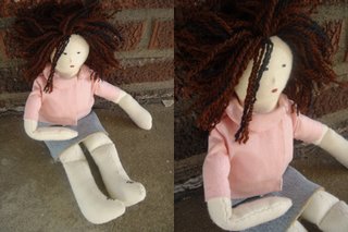
Every once in a while I get the urge to get crafty. Usually I am forced into it by some project one of my children are involved with. But this was brought on by myself after seeing someone on TV do a rag doll. I thought, 'how hard can that be?' Well it was a bit difficult for me seeing that my sewing machine went down during the first stitch. So I had to finish it all by hand. Betsy Ross I'm not...but my daughter loves it all the same.

Monday, December 18, 2006

A Sharp Dressed Man


Here is a spiffy little dude all dressed up and no place to be.

Friday, December 08, 2006

Goldie


It's a sad day here at David Snider Design Studio. We have lost someone very dear to us. My father informed me over the weekend that the king of his backyard water oasis has passed on. Goldie's life has come to a close. He had been the king of the pond for many years. Through cold winters and algae control problems, he swam strong. But it seems as though it was just his time.

This post is for you Goldie! May you swim forever in the great pond in the sky!

Wednesday, December 06, 2006

Love Birds


This is a piece I did for my wife a while back. She's the love of my life!

Sunday, November 26, 2006

Building For The Future


'Building for the Future' was the theme and the Church wanted a T-shirt design for a give-a-way to the babies in the nursery on 'Baby Day'.

Friday, November 17, 2006

Critter in a Can


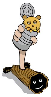
'Critter in a Can'. Catch 'em and Can 'em. Taking care of all your pesky varmints. How good is this? Get rid of your pest problem and put food on your table at the same time.

This is all in fun and I'm having a good time doing the illustration. Eat up everyone! I have got to go now and check my traps...Later.

Thursday, November 16, 2006

Three Strand Cord


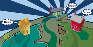
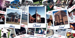
Have you ever tried to break a piece of thread? Not very hard to do. But if you take several strands together and try to break them apart it is a much harder task. So when you hear teaching about children and the threads that run through their life, the example is often given about the 'Three Strand Cord', Home, Church, and School. Such was the theme for a Youth Conference, and I was to design a large backdrop piece for the three day event. The backdrop would be 19 feet by 38 feet.

So I decided to do an illustration that would reflect the mind of a child and how they view things. I wanted a 'Looney Tunes' feel to the whole thing. I reflected on my love of Saturday morning cartoons when I was growing up and wanted to incorporate that into the piece. The piece came out just like I wanted. I was so excited at the prospects that my illustration would be displayed on such a grand scale.

The unfortunate thing was that the conference director didn't share my vision. He wanted the backdrop to be 'full of pictures'. I was so disappointed. He wanted to show all the aspects of a child's life using images.

So I filed away my illustration and pulled out my image editing skills and went to work on 'his' vision for the backdrop. I displayed all the images in a 'polaroid' format, as if a teenager just dumped out all their pictures preparing to put together a scrapbook. The final result was fine but of course my idea was better...right?


Thursday, October 26, 2006

'Elements' in the Wild


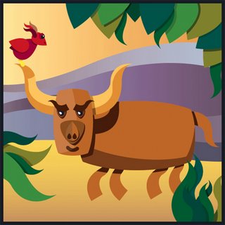
This artwork is for a creative project Vormator. The premise is for designers to use their abilities to create a stunning piece using only 8 basic shapes called the Elements. Each contributing designer will be given the same set of shapes. The design must follow a strict set of guidelines regarding the use and treatment of the set of Elements. I guess you could say that I was feeling a little 'Bullish' when it came to design my piece.

Friday, October 20, 2006

Silhouette

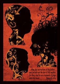
This is a piece I did for my wife's birthday. It measures 18 X 24 and is famed in a simple black frame. It's a modern take on the old silhouettes. I tried to incorporate each of our children's personalities ages 13, 11, and 9.
The reading at the bottom is from Proverbs 1:8-9 "...hear the instruction of thy father, and forsake not the law of thy mother; For they shall be an ornament of grace unto thy head..."

This was fun being able to incorporte my children in a design.

Wednesday, September 20, 2006

School Drama


I'm helping a local school with the design for their drama this year. The drama is based on the great hymn writer and poet Fanny Crosby. They wanted an old look. I thought it turned out nice. Hopefully the design will draw some attention to their drama and help them raise some funds for the school.

Sunday, July 30, 2006

World at War


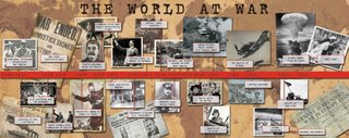
This was created for my sister. She teaches History at a local College and needed a timeline and needed it designed and printed in 24 hours. I told her I would give it my best shot. So after a long night I was ready for print. The finished size was 28.5 inches by 72 inches. I wanted it to feel as if the student had just opened up an old chest up in the attic. I enjoy this type of work, so despite the long hours I had a blast.

Friday, June 02, 2006

Inspirational Design


Here are two designs I recently did. Inspirational designs with a youthful flare.

Tuesday, May 09, 2006

Got Skills?

This is my latest project I did for a youth basketball clinic. The participants ages will be from 6 to 13. They wanted it to have a 'lively' and 'fun' feel to it. It was a fun project to be involved with and to show off a 'little' bit of skill in the process.

Thursday, May 04, 2006

Need a Superhero?

This was a fun project I did for a youth ministry. The book is an 'idea book' full of fun and unique youth activities.

So if you are unable to leap tall projects and unable to outrun those speeding deadlines, maybe you could use some design heroics...just give me a call...never fear...for I am here!

Monday, April 24, 2006

Thunder Over Louisville

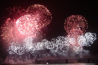
Went down to the banks of the Ohio River to see Thunder Over Louisville on Saturday, along with 800,000 other people. It's the largest fireworks show in North America. Had a great time with my family and friends. This is a picture of some of the fireworks as they are coming off the 2nd Street Bridge. Also Check out this video I shot with my Sony Cyber-Shot. It's only about the last 3 minutes of a 30 minute fireworks display. Thunder Clip

Thursday, April 20, 2006

Hungry?

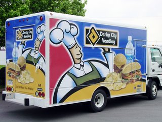
Hungry yet? The logistics of laying out such a project can be a nightmare. But this all went according to plan for the most part.

I Illustrated in Illustrator® then brought into Photoshop® where I added the sandwich and chips then the water bottle. Of course this all needed to be reversed on the other side. Also, I had to make provisions so their logo and critical design elements wouldn't be obstructed by doors or hinges. The rear of the vehicle turned out nice where I was able to place the logo right in the middle of the slide up door. The files are all set up to where the sandwiches and water can be replaced with alternate drinks and snacks for future trucks. This was all digitally printed on a Mimaki JV3#-75 and laminated, with the install consisting of (6) 30" panels a side and (3) panels on the rear. The install was no small task either, taking one man about two days to complete. Now to get me something to eat!

Wednesday, April 12, 2006

I'm a Liar


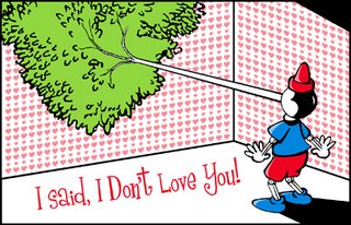
This is a card I designed for my beautiful wife last Valentine's Day. Thought you might enjoy seeing it. And I thought I might earn a few needed 'brownie points' by posting it here.

Tuesday, April 11, 2006

Drummer Boy

Chicago Drummer Boy

I love seeing things like this. This guy had on his band letter jacket from school, he couldn't have been over 16 years old. He was using his talents to make himself some money. I was proud of his drive to get up and go do something. Too many just sit back and wait for things to come to them. To me it was inspiring.

Chicago Trip


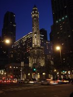
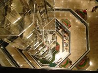
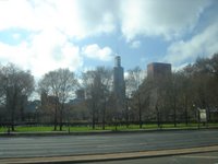
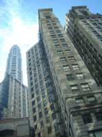
Here are a few pics from my weekend trip to Chicago. Pictured are the old Chicago Water Tower, Ed Debevics Diner, The Water Tower Place glass elevator in the shopping complex, the Sears Tower and just some cool buildings. Had a great time with my family for a few days over the weekend.

Monday, April 03, 2006

Word Up!


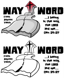
This is a logo I created for a youth group outside Chicago. I took some inspiration from my youth, back in the 70's when the slogan 'One Way' was pretty popular. I put a different slant on it and thought this turned out really nice.